Introduction
User interface design determines how people interact with digital products. Every button, form, navigation menu, dashboard, and mobile screen contributes to the overall experience.
A visually attractive interface is not automatically a useful interface. Good UI design must also support clear navigation, readable content, consistent interaction patterns, and accessibility.
As digital products become more complex, designers need software that helps them create interfaces efficiently while collaborating with developers and product stakeholders.
Modern UI design tools provide far more than drawing capabilities. Many support reusable components, responsive layouts, interactive prototypes, design systems, shared libraries, and developer handoff.
Some tools focus on collaborative product design. Others specialize in desktop workflows, open-source development, interactive websites, or AI-assisted mockups.
Choosing the right platform depends on the type of product, team structure, technical requirements, and expected deliverables.
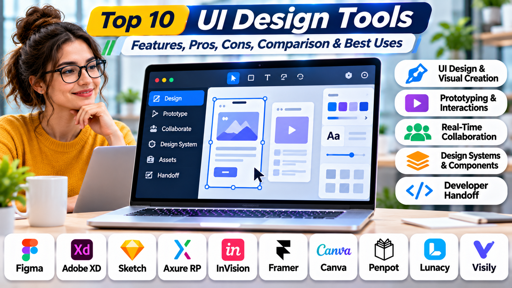
This guide compares ten UI design tools, examines their strengths and limitations, and explains how to select the right software for different design workflows.
What Are UI Design Tools?
UI design tools are software applications used to create the visual and interactive elements of websites, mobile applications, desktop software, and other digital interfaces.
They help designers define layouts, typography, colors, components, visual hierarchy, and interaction states.
Core Functions of UI Design Software
Interface layout: Organizing content, controls, and navigation into understandable screens.
Visual design: Applying typography, colors, icons, spacing, and other visual elements.
Component management: Creating reusable buttons, forms, cards, and interface patterns.
Responsive design: Preparing layouts for different screen sizes and device types.
Prototyping: Connecting screens and simulating interactions before implementation.
Design collaboration: Allowing designers and stakeholders to review and refine work.
Developer handoff: Communicating measurements, assets, component properties, and implementation guidance.
Design systems: Maintaining shared visual and interaction standards across products.
UI Design vs. UX Design
UI design focuses primarily on interface presentation and interaction details.
UX design covers the broader experience of completing tasks, including research, information architecture, workflows, usability, and user satisfaction.
The disciplines overlap, and many tools support both.
What Makes a Good UI Design Tool?
A strong platform should support efficient interface creation, consistent components, collaboration, accessible design practices, and reliable communication with developers.
However, the most feature-rich application is not always the best choice. A small startup may need rapid mockups, while an enterprise design system team may prioritize governance and code integration.
Top 10 UI Design Tools
1. Figma
Short Description
Figma is a collaborative interface design platform used for websites, mobile applications, and digital products.
It provides a shared environment where designers can create screens, build reusable components, organize design systems, and develop interactive prototypes.
One of Figma’s defining strengths is collaboration. Multiple contributors can work within shared files, while stakeholders review designs and provide comments.
For example, a SaaS company designing a customer dashboard can maintain a common component library for navigation, charts, forms, and dialogs.
Designers can reuse approved components across multiple screens, helping maintain consistency.
Figma also supports developer inspection and handoff workflows, making it useful for teams where design and engineering work closely together.
Its broad capabilities make it a strong general-purpose option, although complex files and growing seat requirements can introduce operational and cost considerations.
Key Features
- Collaborative Design Canvas: Allows teams to create and review interfaces in a shared environment.
- Auto Layout: Helps create flexible layouts that adapt when content or component dimensions change.
- Reusable Components: Supports shared buttons, fields, cards, and other interface elements.
- Component Variants: Organizes related states and configurations within component families.
- Variables and Styles: Maintains consistent design values across interfaces.
- Interactive Prototyping: Connects screens and demonstrates supported interactions.
- Developer Handoff: Provides design inspection and implementation information.
- Team Libraries: Distributes approved design assets across projects.
- Plugin Ecosystem: Extends workflows through compatible third-party tools.
Benefits
Figma reduces the friction of collaborating across design teams.
Shared components help prevent inconsistent interface patterns, while prototyping supports early feedback before development begins.
Developer handoff features also reduce the need to recreate measurements and assets manually.
Pros
- Strong real-time collaboration.
- Reusable components and design systems.
- Responsive layout capabilities.
- Interactive prototyping.
- Developer inspection workflows.
- Large ecosystem of integrations and resources.
Cons
- Advanced features may require paid seats.
- Large design files can become difficult to manage.
- Requires governance for complex component libraries.
- Cloud-dependent workflows may not suit every organization.
- Advanced interaction simulation may require specialist tools.
Use Cases
SaaS product design: Creating dashboards, account settings, and administrative interfaces.
Mobile application design: Designing consistent screen flows and reusable components.
Enterprise design systems: Maintaining shared interface standards across products.
Best For
Figma is suitable for collaborative UI teams, product designers, agencies, and organizations managing multiple digital products.
2. Sketch
Short Description
Sketch is a native macOS interface design application known for its focused UI design environment.
It provides tools for creating vector interfaces, reusable symbols, shared styles, and interactive prototypes.
Sketch is particularly appealing to designers who prefer a desktop-first workflow.
For example, a Mac-based product design agency may use Sketch to create mobile application interfaces and maintain reusable component libraries.
Its design-focused workspace helps teams concentrate on interface construction without adopting a broader website publishing platform.
Sketch also offers collaboration and developer handoff capabilities through its associated workspace services.
However, its native editor is limited to macOS, making it less convenient for organizations with designers working across several operating systems.
Key Features
- Vector Interface Editing: Creates scalable interface elements.
- Reusable Symbols: Maintains shared components across designs.
- Shared Styles: Keeps typography and visual properties consistent.
- Layout Tools: Supports precise interface arrangement.
- Interactive Prototypes: Connects screens into navigable experiences.
- Libraries: Distributes common design assets.
- Version History: Supports review of design changes.
- Developer Handoff: Provides interface inspection and asset access.
- Plugin Support: Extends design workflows.
Benefits
Sketch provides a focused environment for professional interface design.
Reusable libraries help teams maintain consistency, while its native application supports workflows preferred by Mac-based designers.
Pros
- Native macOS experience.
- Strong vector design capabilities.
- Reusable symbols and styles.
- Mature UI design workflow.
- Prototyping support.
- Developer handoff capabilities.
Cons
- Native editor requires macOS.
- Mixed-platform design teams face limitations.
- Collaboration capabilities depend on the selected setup.
- Complex interactions may require additional tools.
- Commercial licensing applies.
Use Cases
iOS application design: Creating mobile interface layouts.
Agency workflows: Producing client interface designs.
Component libraries: Maintaining reusable visual assets.
Best For
Sketch is suitable for individual Mac designers and macOS-centered UI teams.
3. Penpot
Short Description
Penpot is an open-source design and prototyping platform focused on collaboration between designers and developers.
It provides a browser-based environment for creating interface designs, reusable components, and interactive prototypes.
A major distinction is its open-source approach and support for self-hosted deployments.
This can be attractive to organizations that want greater control over design infrastructure and data.
For example, a technology company with internal hosting requirements may use Penpot to maintain interface designs without depending exclusively on a proprietary cloud service.
Penpot also emphasizes web-oriented design concepts that can help developers understand implementation details.
Its ecosystem and workflows differ from those of larger commercial design platforms, so teams should evaluate compatibility before migrating existing libraries.
Key Features
- Open-Source Platform: Provides access to an openly developed design environment.
- Self-Hosting: Supports organizations requiring control over deployment.
- Vector Design: Creates scalable interface assets.
- Reusable Components: Maintains shared UI elements.
- Layout Capabilities: Supports structured interface composition.
- Interactive Prototyping: Connects screens into user flows.
- Collaboration: Enables shared design work.
- Developer-Oriented Inspection: Supports communication of implementation properties.
- Design Libraries: Helps organize reusable assets.
Benefits
Penpot offers flexibility for teams concerned about vendor dependence.
Its open-source model supports customization and infrastructure control.
It also provides a collaborative environment for teams working on digital interfaces.
Pros
- Open-source.
- Self-hosting option.
- Collaborative interface design.
- Reusable components.
- Prototyping.
- Developer-oriented workflows.
Cons
- Smaller ecosystem than some established competitors.
- Migration may require adaptation.
- Self-hosting introduces maintenance responsibilities.
- Some advanced workflows differ from commercial alternatives.
- Teams may need additional training.
Use Cases
Self-hosted design environments: Supporting internal infrastructure requirements.
Open-source projects: Collaborating on public or community software.
Product interface design: Creating web and application layouts.
Best For
Penpot is suitable for open-source teams, developers, and organizations prioritizing deployment control.
4. Framer
Short Description
Framer is a visual website design and publishing platform that combines interface creation with interactive web experiences.
It is particularly relevant to teams building marketing websites, landing pages, portfolios, and interactive web presentations.
Unlike conventional UI tools that primarily produce design files, Framer can turn visual work into published websites.
For example, a startup may use Framer to design and launch its product marketing site without creating a separate implementation project for every page.
The platform supports responsive layouts, animations, reusable elements, and content management workflows.
Its design-to-publishing approach can reduce handoff requirements for certain web projects.
However, Framer is not intended to replace every workflow associated with complex native applications or enterprise software design.
Key Features
- Visual Web Design: Creates website layouts through a design-oriented interface.
- Responsive Layouts: Adapts pages to different screen sizes.
- Interactive Effects: Adds supported animations and transitions.
- Reusable Components: Maintains consistent website elements.
- Website Publishing: Deploys supported websites directly.
- Content Management: Supports structured website content.
- Collaboration: Enables team review and editing.
- Templates: Accelerates common website projects.
- Site Optimization Tools: Supports relevant publishing and website management workflows.
Benefits
Framer reduces the gap between website design and deployment.
It allows teams to refine and publish visual experiences without a traditional design-to-development handoff for every change.
Pros
- Design-to-publishing workflow.
- Responsive website design.
- Interactive animations.
- Reusable components.
- Website templates.
- Suitable for marketing teams.
Cons
- Less suitable for complex enterprise application interfaces.
- Publishing and hosting costs require evaluation.
- Native mobile application design is not its primary focus.
- Platform-specific implementation constraints apply.
- Advanced application logic may require other technologies.
Use Cases
Startup websites: Creating product landing pages.
Marketing campaigns: Publishing interactive promotional pages.
Portfolios: Designing visually engaging professional websites.
Best For
Framer is suitable for web designers, startups, and marketing teams creating publishable websites.
5. UXPin
Short Description
UXPin is a product design and prototyping platform with an emphasis on interactive interfaces and design system alignment.
It is particularly relevant to teams that want prototypes to behave more like real software.
UXPin supports reusable design elements and advanced interaction workflows.
Its code-component capabilities can also help teams work with actual implementation components in supported environments.
For example, an enterprise product team may use UXPin to design a complex administrative workflow using components aligned with its frontend design system.
This can reduce differences between prototypes and eventual implementation.
However, configuring advanced code-backed workflows requires coordination with engineering teams.
Key Features
- Interactive Interface Design: Creates detailed product screens.
- Advanced Prototyping: Supports complex interaction behavior.
- Reusable Components: Maintains consistent interface patterns.
- Design System Workflows: Supports shared component standards.
- Code Component Integration: Connects supported development components with design workflows.
- Conditional Interactions: Models selected logic-based behaviors.
- Collaboration: Supports team review and feedback.
- Developer Handoff: Communicates implementation details.
- Component Consistency: Helps align design and production interfaces.
Benefits
UXPin is useful when visual prototypes must communicate more than simple screen transitions.
Its component-oriented approach can improve alignment between design and engineering.
Pros
- Advanced interactive prototypes.
- Design system integration.
- Code-backed component options.
- Useful for enterprise applications.
- Collaboration capabilities.
- Developer-oriented workflows.
Cons
- More complex than lightweight UI editors.
- Advanced setup requires technical coordination.
- Commercial pricing.
- Not necessary for simple mockups.
- Code integration depends on supported technologies.
Use Cases
Enterprise dashboards: Designing complex interface states.
Design system products: Working with reusable components.
Interactive application flows: Simulating conditional behavior.
Best For
UXPin is suitable for enterprise product teams and designers collaborating closely with frontend engineers.
6. Lunacy
Short Description
Lunacy is a desktop interface design application developed by Icons8.
It supports UI design workflows across Windows, macOS, and Linux.
This cross-platform desktop approach makes Lunacy relevant to teams that want local design software without limiting their workflow to macOS.
For example, a small development agency using Windows and Linux workstations may use Lunacy to create application mockups and interface assets.
The application provides vector design tools, reusable components, and selected collaboration and productivity capabilities.
Lunacy is particularly appealing to designers seeking an accessible desktop workflow.
However, organizations with complex enterprise design systems should evaluate its collaboration and integration capabilities against their requirements.
Key Features
- Cross-Platform Desktop Editor: Supports major desktop operating systems.
- Vector Editing: Creates scalable UI elements.
- Interface Components: Supports reusable design assets.
- Layout Tools: Helps arrange interface elements.
- Asset Resources: Connects with relevant Icons8 design resources.
- File Compatibility: Supports selected design file workflows.
- Offline Editing: Enables supported local design work.
- Prototyping Capabilities: Supports basic interface flow demonstrations.
- Productivity Features: Provides tools intended to accelerate design tasks.
Benefits
Lunacy provides a desktop UI design option for teams using different operating systems.
It can reduce dependence on browser-only workflows and may suit smaller teams seeking straightforward interface design.
Pros
- Windows, macOS, and Linux support.
- Desktop-first workflow.
- Vector design capabilities.
- Reusable interface assets.
- Offline functionality.
- Accessible entry point.
Cons
- Smaller ecosystem than Figma.
- Enterprise collaboration capabilities require evaluation.
- Some advanced assets or services may have separate costs.
- Complex prototyping may require another tool.
- File compatibility should be tested before migration.
Use Cases
Desktop UI design: Creating application layouts.
Small agency projects: Producing web and mobile mockups.
Cross-platform teams: Supporting designers on different operating systems.
Best For
Lunacy is suitable for independent designers and small teams seeking cross-platform desktop software.
7. Uizard
Short Description
Uizard is an AI-assisted interface design platform focused on rapid mockup creation.
It helps users turn ideas into visual interface concepts without requiring advanced design expertise.
This makes it useful for product managers, startup founders, and teams exploring early product ideas.
For example, a founder may describe a customer booking application and use Uizard to create an initial set of interface screens.
The resulting designs can provide a starting point for discussions with developers, customers, or investors.
Uizard is especially valuable during early exploration, when speed matters more than detailed component engineering.
AI-generated layouts still require human review for usability, accessibility, accuracy, and brand consistency.
Key Features
- AI-Assisted UI Generation: Creates interface concepts from supported inputs.
- Prompt-Based Design: Turns written descriptions into draft layouts.
- Wireframe Creation: Supports early structural designs.
- Mockup Editing: Allows users to refine generated screens.
- Design Templates: Provides starting points for common applications.
- Interactive Prototypes: Supports basic screen navigation.
- Collaboration: Enables feedback and review.
- Visual Customization: Adjusts interface appearance.
- Rapid Concept Exploration: Helps compare alternative ideas.
Benefits
Uizard reduces the effort required to produce initial interface concepts.
It can make product discussions more concrete before teams invest in detailed design.
Pros
- AI-assisted mockups.
- Accessible to non-designers.
- Rapid concept creation.
- Templates.
- Basic prototyping.
- Useful for early product discussions.
Cons
- Generated designs require validation.
- Limited compared with advanced design system tools.
- AI output may be generic.
- Complex interactions need specialist software.
- Usage limits depend on the plan.
Use Cases
Startup ideation: Exploring application concepts.
Product workshops: Creating visual examples for discussions.
Early stakeholder reviews: Communicating proposed layouts.
Best For
Uizard is suitable for founders, product managers, and teams needing rapid UI concepts.
8. Visily
Short Description
Visily is an AI-assisted design platform focused on wireframes, mockups, and collaborative product ideation.
It helps teams transform ideas and visual references into editable interface designs.
Visily is particularly relevant to non-designers who need to communicate interface requirements.
For example, a business analyst may create a dashboard mockup to demonstrate how users should review operational data.
The design can then be shared with product designers and developers for further refinement.
Visily supports collaborative workflows and can help teams move from informal ideas to structured visual concepts.
However, detailed production design may still require a more comprehensive UI design environment.
Key Features
- AI-Assisted Design: Supports rapid interface generation.
- Wireframing: Creates low-fidelity layouts.
- High-Fidelity Mockups: Develops more detailed interface concepts.
- Templates: Accelerates common screen designs.
- Reference-Based Workflows: Supports selected visual input methods.
- Collaboration: Enables team review.
- Component Resources: Provides reusable interface elements.
- Prototype Sharing: Communicates interface flows.
- Visual Editing: Allows iterative refinement.
Benefits
Visily helps product teams communicate ideas without requiring every contributor to become a professional designer.
It is useful for turning requirements into visual discussions.
Pros
- Accessible to non-designers.
- AI-assisted workflows.
- Wireframing and mockups.
- Collaboration.
- Templates.
- Rapid iteration.
Cons
- Not a replacement for every advanced UI design workflow.
- Generated designs need review.
- Complex design systems require additional capabilities.
- Detailed interactions may be limited.
- Plan restrictions may apply.
Use Cases
Business software planning: Drafting dashboard concepts.
Product discovery: Visualizing early requirements.
Cross-functional workshops: Communicating interface ideas.
Best For
Visily is suitable for product managers, business analysts, and collaborative teams creating early UI designs.
9. Webflow
Short Description
Webflow is a visual website development platform that allows teams to design, build, and publish responsive websites.
It is especially relevant when the desired output is a functioning website rather than a standalone design file.
Webflow provides visual layout tools that correspond closely to web development concepts.
For example, a B2B software company may use Webflow to build a marketing website with product pages, case studies, and a resource center.
Designers can manage layout, styling, content, and responsive behavior within the platform.
Its website publishing capabilities reduce the need for a separate frontend implementation process in many marketing projects.
However, Webflow is not intended to replace a full application development framework for complex business software.
Key Features
- Visual Website Builder: Creates web layouts through a graphical interface.
- Responsive Design: Supports layouts across device sizes.
- CSS-Oriented Styling: Provides detailed visual control.
- Reusable Components: Supports consistent website structures.
- CMS Capabilities: Manages structured content.
- Interactions and Animation: Adds supported dynamic effects.
- Website Publishing: Deploys sites through supported hosting workflows.
- Collaboration: Supports team-based website production.
- SEO Configuration: Provides tools for managing selected website metadata.
Benefits
Webflow combines design and website implementation.
It is useful for teams that want greater visual control than basic website builders while avoiding extensive custom frontend development.
Pros
- Visual website development.
- Responsive layouts.
- CMS support.
- Publishing capabilities.
- Detailed styling.
- Useful marketing website workflows.
Cons
- Not primarily a native application UI tool.
- Advanced application logic may require other systems.
- Hosting and workspace costs need evaluation.
- Platform-specific constraints apply.
- Complex websites require technical understanding.
Use Cases
Marketing websites: Building company and product sites.
Content websites: Managing CMS-driven pages.
Landing pages: Publishing responsive campaign experiences.
Best For
Webflow is suitable for web designers, agencies, and marketing teams producing live websites.
10. Mockplus
Short Description
Mockplus provides tools for interface prototyping, design collaboration, and developer handoff.
It is relevant to teams that need to move from early concepts to interactive demonstrations and implementation discussions.
For example, a product team designing an employee scheduling application may use Mockplus to create screens and connect them into a navigable prototype.
Stakeholders can review the proposed workflow before developers begin implementation.
Mockplus also offers collaboration-oriented capabilities for organizing design feedback and communicating requirements.
Its practical value depends on whether a team prioritizes rapid prototyping, review, or design handoff.
Organizations with large design systems should evaluate component management and integration requirements carefully.
Key Features
- UI Mockup Creation: Produces interface layouts.
- Interactive Prototyping: Connects screens into navigable flows.
- Component Libraries: Provides reusable interface elements.
- Design Templates: Accelerates common workflows.
- Collaboration: Supports team review.
- Commenting: Collects stakeholder feedback.
- Developer Handoff: Communicates design specifications.
- Project Organization: Helps manage interface work.
- Design Review Workflows: Supports iteration before development.
Benefits
Mockplus helps teams communicate interface behavior through interactive examples.
Its collaboration capabilities can reduce ambiguity during design review and development handoff.
Pros
- Rapid UI prototyping.
- Reusable components.
- Collaboration.
- Developer handoff.
- Templates.
- Suitable for product teams.
Cons
- Less extensive ecosystem than major design platforms.
- Advanced interactions may require other tools.
- Design system capabilities need evaluation.
- Commercial features vary by product and plan.
- File migration should be tested.
Use Cases
Product prototypes: Demonstrating interface workflows.
Stakeholder reviews: Gathering feedback before development.
Development handoff: Communicating screen layouts and interactions.
Best For
Mockplus is suitable for product teams seeking practical UI mockups, prototypes, and design collaboration.
Comparison Table: Top 10 UI Design Tools
| Tool | Best For | Supported Platforms | Standout Feature | Pricing Model |
|---|---|---|---|---|
| Figma | Collaborative product design | Web, desktop applications | Shared components and collaboration | Free and paid |
| Sketch | Mac-native UI design | macOS editor, web workspace | Focused vector design | Commercial |
| Penpot | Open-source design | Web, self-hosted | Open-source collaboration | Free and commercial options |
| Framer | Interactive websites | Web | Design-to-publishing | Free and paid |
| UXPin | Advanced product interfaces | Web | Code-aligned components | Commercial |
| Lunacy | Desktop UI design | Windows, macOS, Linux | Cross-platform desktop editing | Free and paid services |
| Uizard | AI-assisted mockups | Web | Prompt-based UI concepts | Free and paid |
| Visily | Non-designer interface planning | Web | AI-assisted wireframing | Free and paid |
| Webflow | Visual website development | Web | Responsive site publishing | Free and paid |
| Mockplus | Prototypes and handoff | Web and supported desktop workflows | Rapid interactive mockups | Free and paid |
Which UI Design Tool Is Right for You?
For Collaborative Product Teams
Figma is a strong choice when multiple designers, developers, and stakeholders need to work with shared design assets.
For Mac-Based Designers
Sketch offers a focused desktop experience with reusable components and prototyping.
For Open-Source and Self-Hosted Requirements
Penpot is particularly relevant when infrastructure control and open-source licensing matter.
For Marketing Websites
Framer and Webflow are suitable when teams need to publish functioning websites.
Framer emphasizes visual interaction design, while Webflow offers detailed website construction and content management.
For Complex Application Interfaces
UXPin is worth evaluating when prototypes must represent advanced behavior or align closely with coded components.
For Rapid Product Concepts
Uizard and Visily help teams create early designs with less manual effort.
For Desktop-Oriented Workflows
Lunacy provides a cross-platform desktop option.
For Lightweight Product Prototyping
Mockplus supports interface mockups, interactions, collaboration, and handoff.
Selection Checklist
Before choosing a platform, assess:
- Supported operating systems and deployment options.
- Component and design system capabilities.
- Responsive layout support.
- Collaboration and review features.
- Prototype interaction requirements.
- Developer handoff.
- Accessibility workflow support.
- Import, export, and integration options.
- Licensing and total cost.
Best UI Design Tools for Different Users
| User Type | Recommended Tool | Reason |
|---|---|---|
| Product design team | Figma | Collaboration and shared libraries |
| Independent Mac designer | Sketch | Native UI design workflow |
| Open-source organization | Penpot | Open development and hosting control |
| Marketing designer | Framer | Interactive website publishing |
| Enterprise UX designer | UXPin | Complex interaction and component workflows |
| Windows-based designer | Lunacy | Desktop design environment |
| Startup founder | Uizard | Rapid AI-assisted concepts |
| Business analyst | Visily | Accessible interface planning |
| Web agency | Webflow | Visual website development |
| Small product team | Mockplus | Rapid prototyping and review |
Practical Example: Designing a Customer Support Dashboard
Consider a SaaS company developing a customer support dashboard.
The interface must display support tickets, customer profiles, agent assignments, and performance metrics.
Step 1: Define User Requirements
The team interviews support agents and managers to identify important tasks.
Step 2: Map Core Workflows
Researchers document ticket assignment, status changes, escalation, and reporting.
Step 3: Create Initial Wireframes
Designers produce basic layouts to establish information hierarchy.
Step 4: Choose a UI Design Platform
The team selects Figma because multiple designers and developers need to collaborate.
Step 5: Build Reusable Components
Buttons, tables, status indicators, filters, and forms are organized into shared libraries.
Step 6: Design Responsive Screens
The team creates layouts for desktop and smaller screens.
Step 7: Add Interaction States
Designers specify loading, empty, error, disabled, and confirmation states.
Step 8: Create a Prototype
The team connects screens to demonstrate common support workflows.
Step 9: Conduct Usability Testing
Support agents attempt realistic tasks using the prototype.
Step 10: Prepare Developer Handoff
Developers review component specifications and implementation requirements.
Step 11: Validate the Implementation
The team compares the working application with approved designs and checks accessibility.
Step 12: Maintain the Design System
Reusable components are updated as new product requirements emerge.
This workflow shows how UI design software supports the entire journey from requirements to implementation.
Frequently Asked Questions (FAQs)
1. What are UI design tools?
UI design tools help create visual layouts, components, and interaction patterns for digital interfaces.
2. What is the difference between UI and UX design?
UI focuses on interface elements and presentation, while UX addresses the broader user experience.
3. Which UI design tool is best for beginners?
Uizard, Visily, and other template-oriented tools can be accessible starting points, depending on the task.
4. Is Figma suitable for professional product design?
Yes. It supports collaborative interface design, reusable components, prototypes, and developer handoff.
5. What is an open-source UI design tool?
An open-source tool makes its source code available under an open-source license. Penpot is an example.
6. Can UI design tools create responsive layouts?
Many tools support responsive or adaptive layout workflows, although capabilities differ.
7. What are UI components?
UI components are reusable interface elements such as buttons, forms, menus, and cards.
8. What is developer handoff?
Developer handoff communicates design specifications, assets, component behavior, and implementation guidance.
9. Can AI generate complete UI designs?
AI can produce draft interfaces, but human review is needed for usability, accessibility, accuracy, and implementation quality.
10. What is the difference between a mockup and a prototype?
A mockup communicates appearance, while a prototype demonstrates selected interactions or behavior.
11. Is Sketch available on Windows?
Its native design editor is macOS-focused, although associated web collaboration capabilities may be accessible from other systems.
12. Can Penpot be self-hosted?
Yes. Penpot supports self-hosted deployment options.
13. Is Framer a replacement for traditional UI software?
It can replace some website design and publishing workflows, but not every complex application design requirement.
14. What should enterprises prioritize?
Enterprises should evaluate design systems, governance, collaboration, accessibility, integration, and long-term maintainability.
15. Which UI design tool is best overall?
There is no universal winner. The best choice depends on product type, team workflow, technical constraints, and design requirements.
Final Thoughts
UI design tools help teams transform product requirements into understandable, consistent, and visually effective interfaces.
Figma and Sketch support professional interface design, while Penpot offers an open-source alternative.
Framer and Webflow connect visual design with website publishing.
UXPin supports complex interactions and code-aligned workflows, while Lunacy provides cross-platform desktop editing.
Uizard and Visily accelerate early design exploration, and Mockplus supports practical prototyping and collaboration.
The most effective choice is the platform that fits the team’s actual workflow and produces designs that can be tested, implemented, and maintained reliably.